
How to Create a Chart/Graph
- continued
| Let’s mark our vertical axis with these graduations. It’s very critical that we place these graduations evenly. You’ll want to use a ruler or graph paper to make sure that each is exactly the same size: |
|
 |
|
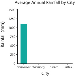
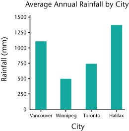
| In a similar way, we create the bars for the other three cities. We chose an aqua shade for the colour of our bars since that’s the colour most easily associated with rainfall. This helps reinforce what our bar graph is all about. That’s it! |
 |